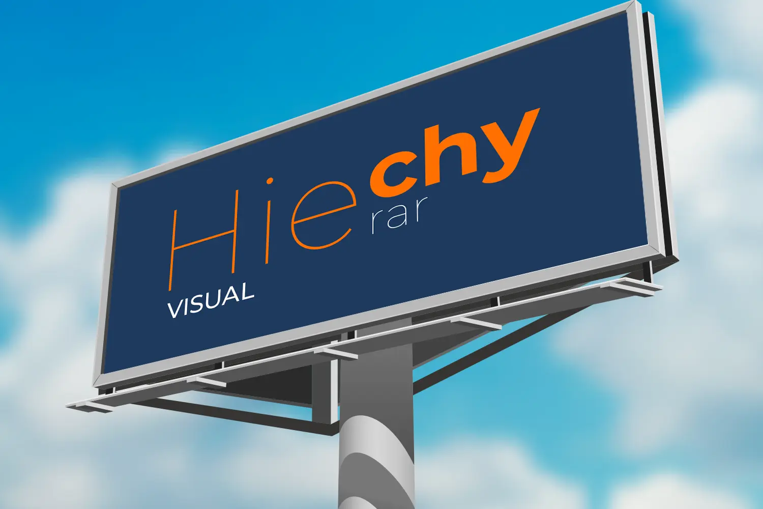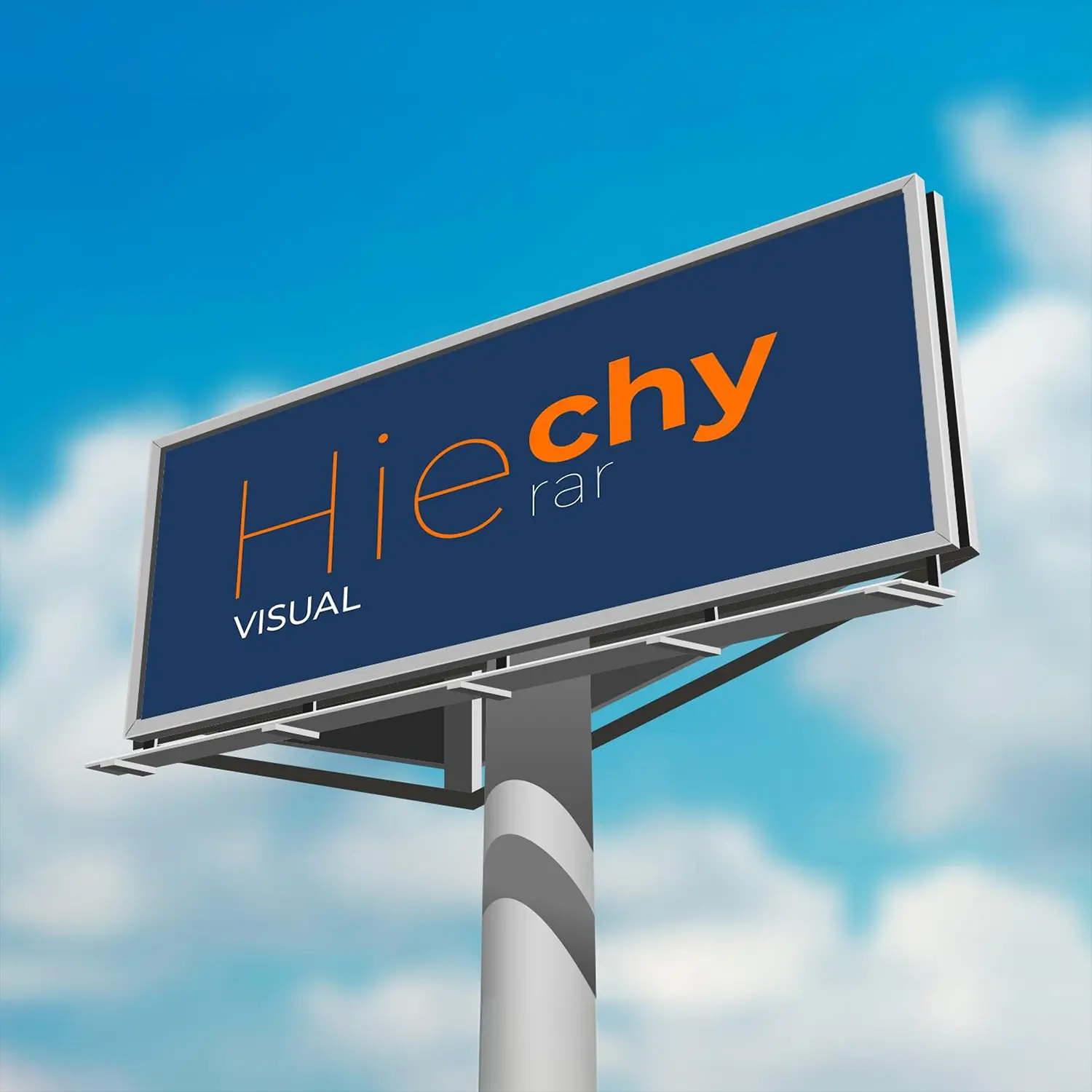
The Importance of Visual Hierarchy in Design
Discover how visual hierarchy enhances the clarity and effectiveness of design, guiding users through content in a meaningful and engaging way. Visual hierarchy helps users process and navigate information effortlessly. It ensures that key elements stand out, improving user experience by leading them through content in a logical flow. By using techniques like size, contrast, and spacing, designers can prioritize what’s most important, making designs more intuitive and engaging.What is Visual Hierarchy?
Visual hierarchy refers to the arrangement and presentation of elements in a design that prioritizes their importance. It’s the tool designers use to guide the viewer’s eye through a page, ensuring the most important information is noticed first. Whether it’s a website, app, or printed piece, a strong visual hierarchy organizes elements so users can digest content without confusion.
Key Elements of Visual Hierarchy
Several key components contribute to building a strong graphic hierarchy:
- Size and Scale: Larger elements naturally attract attention, signaling importance. For example, titles, headers, or call-to-action buttons are typically larger to stand out.
- Color and Contrast: High contrast draws the eye to specific areas, making text or buttons more noticeable and legible.
- Typography: Font weight, style, and spacing differentiate content levels, such as headings, subheadings, and body text, making the structure clear.
- Proximity and Spacing: Grouping related elements together creates connections, while adequate spacing separates unrelated content for clarity.
- Alignment and Layout: Consistent layouts present content logically, guiding users to process information efficiently.
“A strong visual hierarchy organizes elements so that users can digest content without confusion, guiding their eyes to what matters most.”
Why Visual Hierarchy is Crucial for User Experience
A clear and intentional Design hierarchy enhances user experience by making content more digestible and engaging. It reduces cognitive load, enabling users to process information quickly. By guiding attention to the most critical parts of the design, it improves usability and encourages actions, like clicking buttons or reading further.
Designs with poor hierarchy risk overwhelming users, leading to frustration or disengagement. In a world where attention spans are short, a strong hierarchy is crucial for design success.
The Role of Visual Hierarchy in Branding
Visual hierarchy is vital for user navigation and plays a key role in conveying a brand’s message. By emphasizing certain elements, designers highlight a brand’s identity and key calls-to-action.
For instance, websites often emphasize the brand logo and tagline at the top, making them prominent with bold fonts or distinctive colors. This ensures that the first thing users see is the brand’s identity, building recognition and trust.
When aligned with a brand’s values and mission, a well-executed Graphic hierarchy creates a consistent brand experience across platforms.
“By prioritizing elements through size, color, and layout, visual hierarchy improves usability and encourages actions, making designs more intuitive and engaging.”
Best Practices for Creating Visual Hierarchy in Design
- Start with a clear purpose: Identify the most important elements and ensure they stand out using size, color, or placement.
- Use typography effectively: Ensure headings are distinct from body text to clarify content structure.
- Apply contrast thoughtfully: Use bold colors to emphasize important elements but avoid overuse to maintain balance.
- Emphasize key actions: Highlight calls-to-action (e.g., “Sign Up” or “Buy Now”) by making them prominent but not overwhelming.
- Keep it simple: Too many focal points can dilute a design’s impact. A clean, uncluttered layout leads the user’s eye naturally from one element to the next.
Real-World Examples
Leading brands use Graphic hierarchy to improve user experience and communicate effectively. E-commerce websites, for instance, emphasize product images and prices to help users quickly find what they’re looking for. Editorial sites highlight headlines for easy scanning before diving into articles.
For further insights into the importance of layout, check out our post on The Future of Print in a Digital World, where we discuss balancing print and digital design.
Enhancing Your Designs with Visual Hierarchy
Visual hierarchy is a fundamental design principle that enhances usability, directs attention, and improves the overall user experience. Whether you’re designing a website, app, or brochure, prioritizing elements using visual hierarchy ensures your designs communicate clearly and effectively.


Recent Comments