Famous Brands and the Fonts Behind Their Logos
In branding, the logo is a powerful symbol of identity. It communicates the brand’s essence at a glance, and the choice of font is a crucial part of the logo design process. From sleek sans-serifs to timeless serifs, fonts play a major role in expressing the brand’s personality and values. Let’s dive into some famous brands and the fonts used in their iconic logos.
1. Dunkin’ Donuts – Debussy
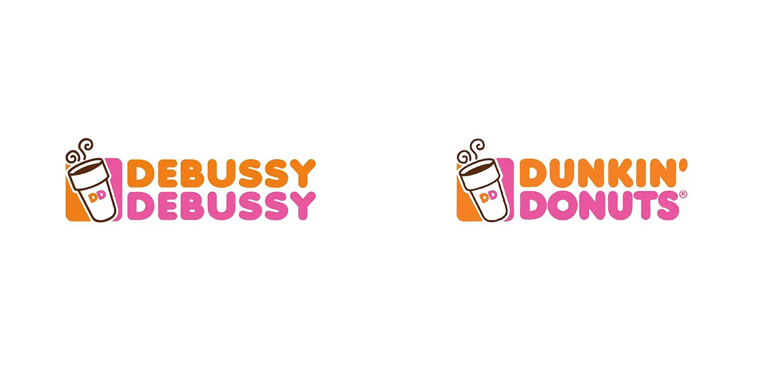
Dunkin’ Donuts uses Debussy, a fun and approachable typeface that reflects the brand’s lighthearted, on-the-go culture. The rounded letters make the logo instantly recognizable and convey an energetic vibe.
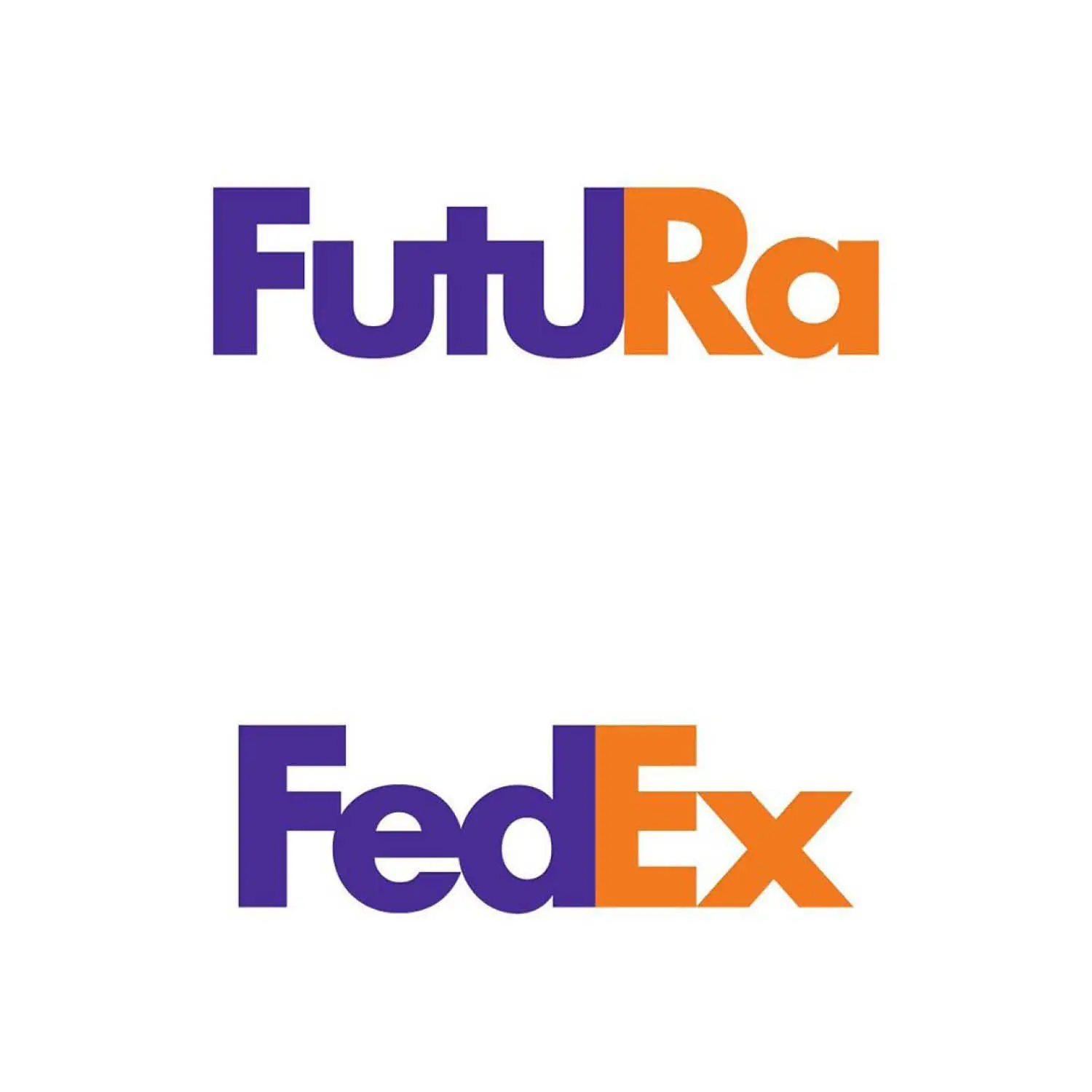
2. FedEx – Futura Bold
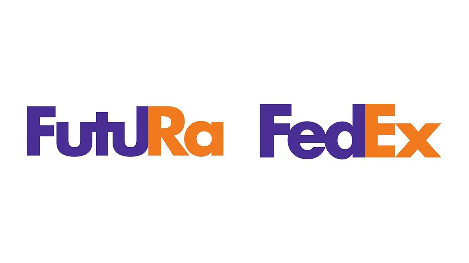
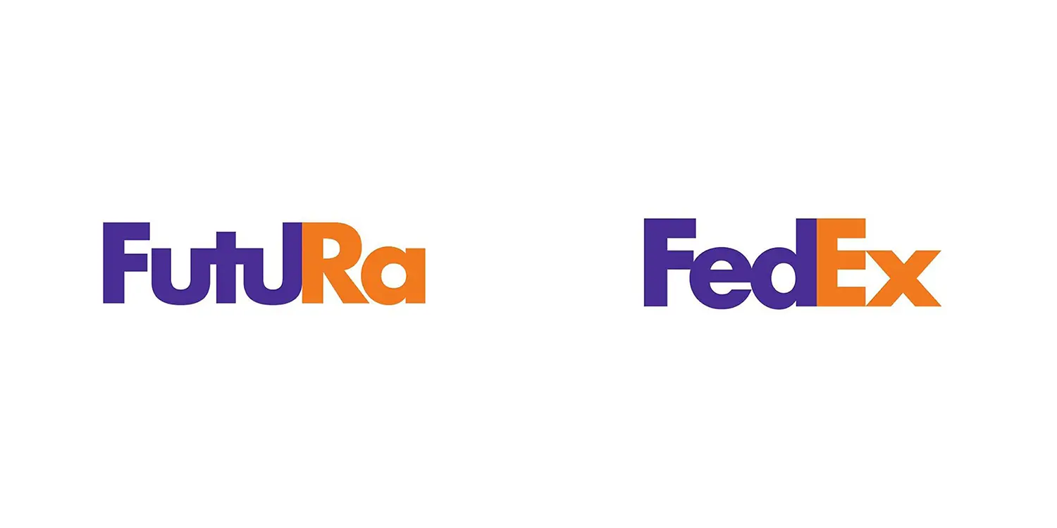
The Futura Bold typeface in FedEx’s logo is a strong geometric sans-serif font. The hidden arrow between the “E” and “X” symbolizes speed and precision, further emphasizing the brand’s commitment to fast logistics.
3. Amazon – Officina Sans
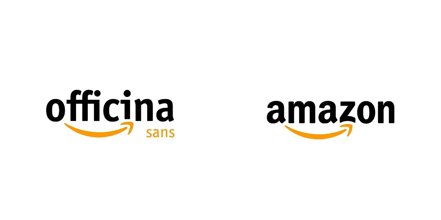
Amazon’s logo features Officina Sans, a modern and clean typeface. The smiley arrow from “A” to “Z” reflects the company’s vast marketplace, and the professional yet approachable design of Officina Sans complements Amazon’s commitment to delivering a wide range of products efficiently.
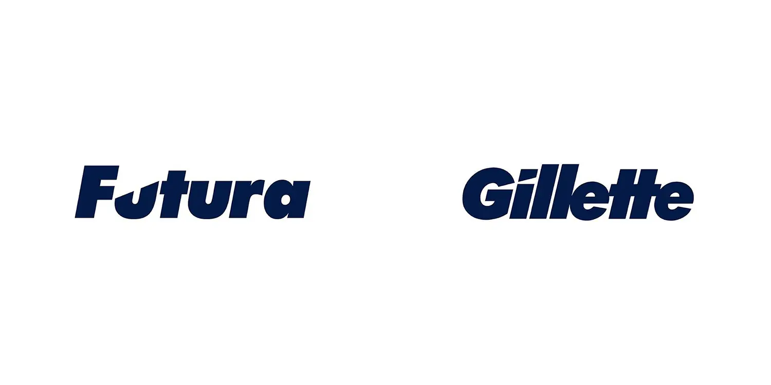
4. Gillette – Futura
The Futura typeface used by Gillette reflects the brand’s focus on precision and technological advancement, with its clean lines symbolizing sharpness and innovation.
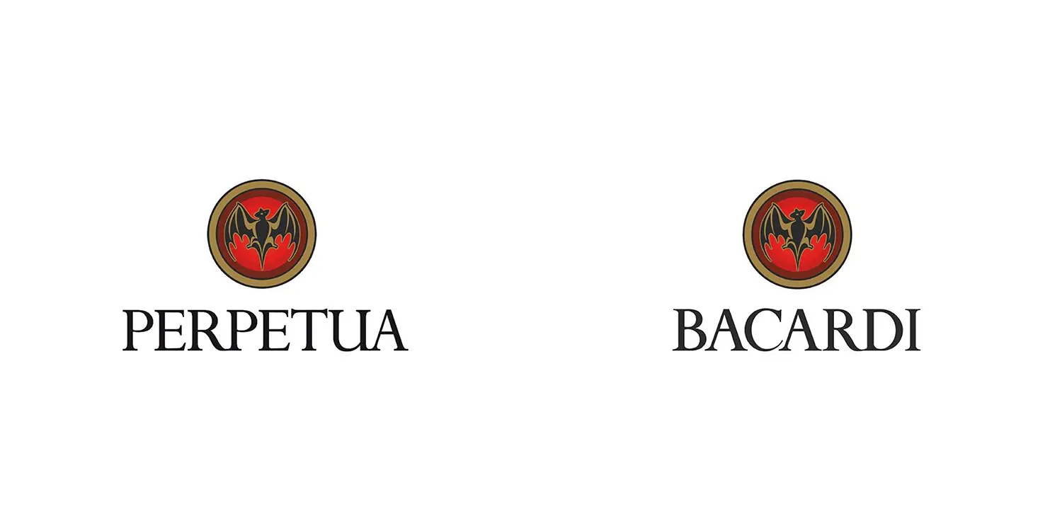
5. Bacardi – Perpetua
Bacardi’s bat logo is complemented by the serif font Perpetua, giving the brand an air of sophistication and heritage. Perpetua is timeless, much like Bacardi’s 150+ year-old legacy, symbolizing trust and tradition.
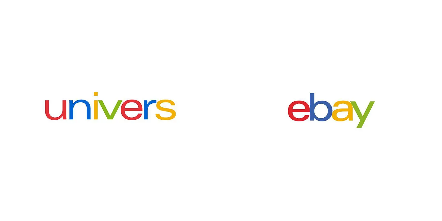
6. eBay – Univers
eBay’s iconic logo features the Univers typeface, a classic sans-serif font known for its simplicity and versatility. The colorful letters give the logo a lively and dynamic feel, perfectly suited for the online marketplace.
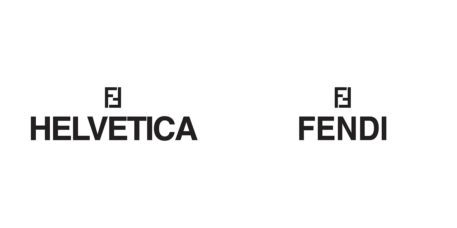
7. Fendi – Helvetica
Fendi’s logo uses the bold and versatile Helvetica, often hailed as the epitome of modern design. The font reflects Fendi’s blend of tradition and contemporary style.
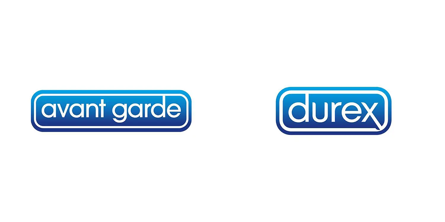
8. Durex – Avant Garde
The Avant Garde font in Durex’s logo is sleek and modern, projecting confidence, innovation, and trustworthiness-essential attributes in the personal care industry.
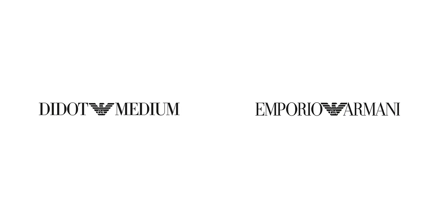
9. Emporio Armani – Didot Medium
Emporio Armani’s logo uses Didot Medium, a high-contrast serif font synonymous with sophistication and luxury, perfectly aligned with the brand’s high-fashion image.
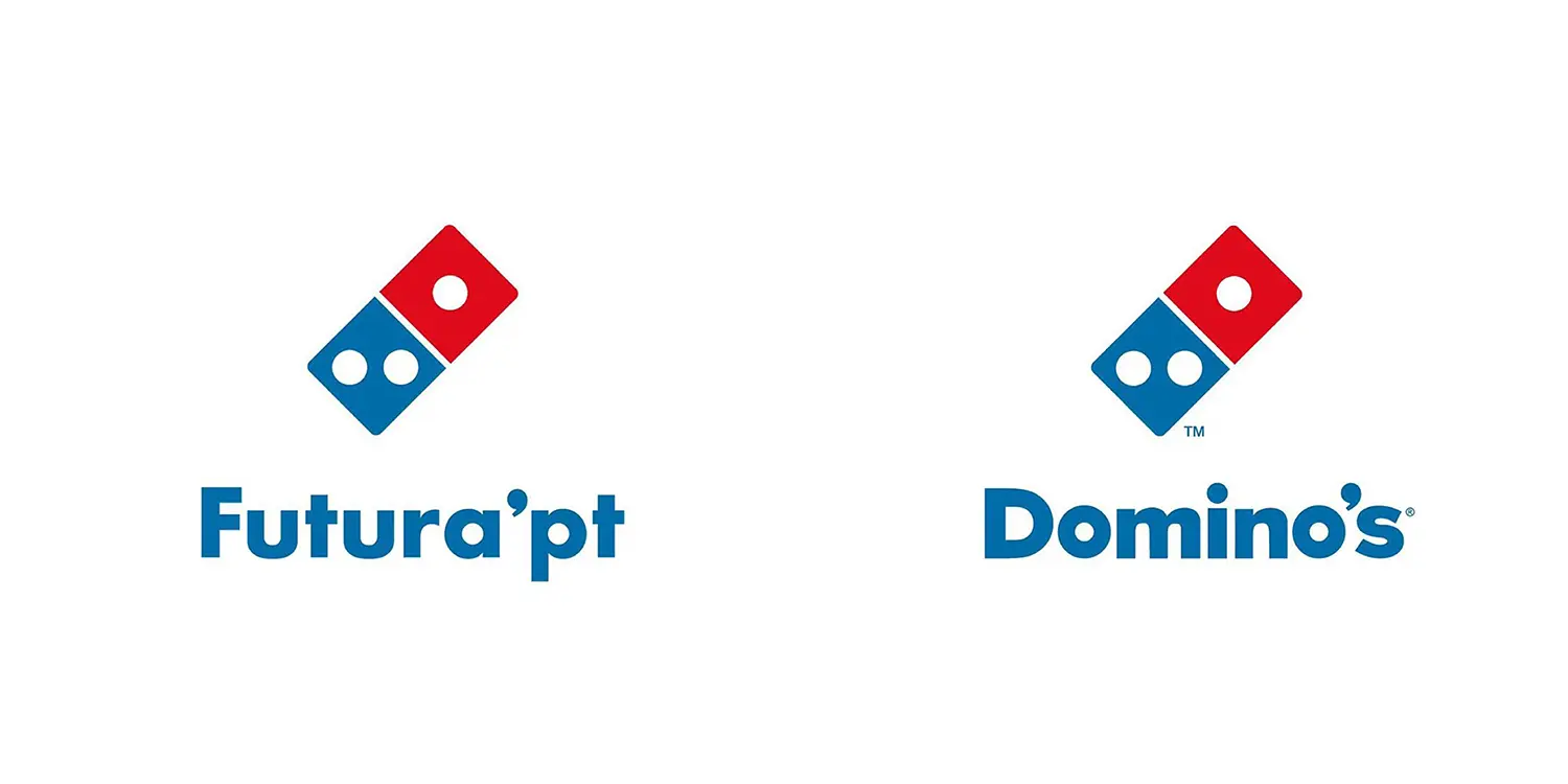
10. Domino’s Pizza – Futura PT
Domino’s modern logo uses Futura PT, a geometric sans-serif font that projects efficiency and simplicity. The clean lines of Futura reinforce the brand’s promise of quick, reliable pizza delivery.
Conclusion
The choice of font in a logo is never random-it’s a thoughtful decision that reflects a brand’s personality, heritage, and mission. From the sleek professionalism of Officina Sans for Amazon to the luxury and timelessness of Didot Medium for Emporio Armani, fonts are a crucial part of a brand’s visual identity. For businesses and startups looking to develop their brand identity, studying the typography of famous brands can provide inspiration for crafting a logo that speaks to your core values.
Further Reading
To continue learning about brand design strategies, check out these articles:
- Brand vs. Design Strategy: Unpacking the Difference – Learn how brand and design strategies differ and how they can both impact your brand’s identity.
- Strategies For Digital Marketing Success in 2024 – Discover key strategies to elevate your marketing efforts in the coming year.
- Design Principles: Exploring Balance, Contrast, Hierarchy, and Repetition in Visual Design – Dive into essential visual design principles that make brands stand out.

Recent Comments